And it’s here to give you that feel warm and fuzzy feeling. No really, that’s the idea!
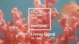
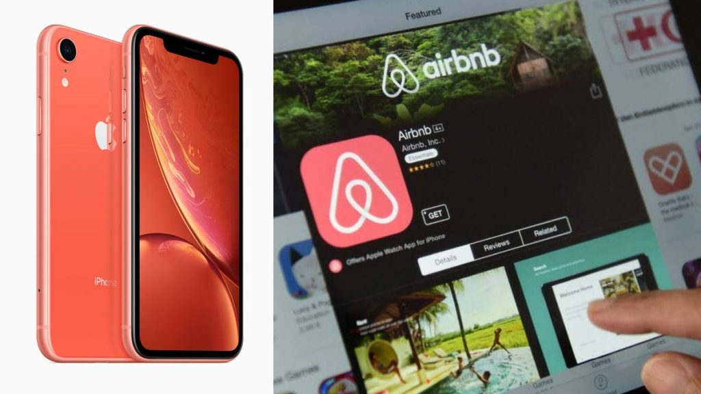
The folks at the Pantone Color Institute elaborate, “Just as coral reefs are a source of sustenance and shelter to sea life, vibrant yet mellow, Pantone 16-1546, Living Coral embraces us with warmth and nourishment to provide comfort and buoyancy in our continually shifting environment.” Chances are you’ve been seeing the warm golden-pink already, ala trendsetters like Apple and Airbnb.
Color is important to get the right feeling. Authentic, sociable, and spirited, the Living Coral color is great tool to help positively influence purchasing decisions.
And Pantone is making it easier for creatives and designers to help brands embrace Living Coral. Pantone’s partnership with Adobe Stock gives creatives and designers a curated group of Living Coral-colored images to pick and build from.
Thanks to its creation of the revolutionary and universal Pantone Matching System® in 1963, Pantone is widely considered THE color authority not only the design industry but also the paint, textile, and plastic industries. Pantone’s Color Institute decides the Color the Year and puts a lot of thought and science into picking Living Coral and all the other COTYs, using fancy-sounding tech like the “Spectrophotometer” and “SpectraLight.” Politics, fashion, pop culture, sports, technology and social issues all influence the selection of potential colors.