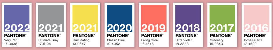
At the end of each calendar, Pantone releases its selection for the “Color of the Year” – this selection sets the stage for the year ahead in fashion and design.
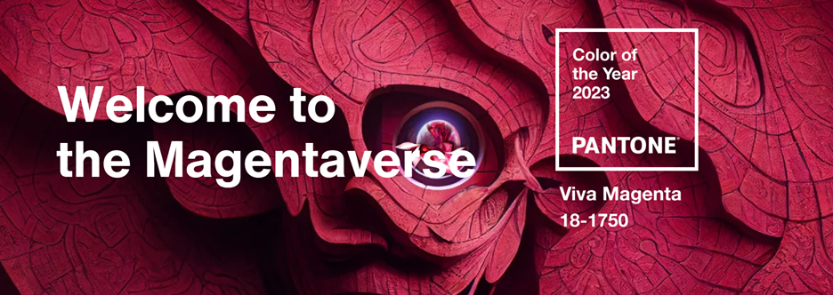
The 2023 selection was a vibrant shade of magenta, “Viva Magenta” – a shade, according to Panton is “rooted in nature descending from the red family and expressive of a new signal of strength. Viva Magenta is brave and fearless, and a pulsating color whose exuberance promotes a joyous and optimistic celebration, writing a new narrative.”
We asked several of our designers to share their thoughts on this color selection.

Andrea: I love this color! I’ve played around using it several recent core designs. I like it because it’s a nice neutral warm tone that doesn’t lean too feminine or pink and comes off more dynamic and modern.

Jen: Magenta! Personally, I would try to use it in EVERYTHING! But, realistically we would use it as an accent color. Just a touch of bright color goes a long way and makes a bold statement, especially when paired with more muted/subdued tones and colors.

Jeff: This year’s color is very vibrant and powerful and excels at catching people’s attention. So, I anticipate using this color whenever there is a need to draw attention to a specific area in a design such as a headline or call-to-action.
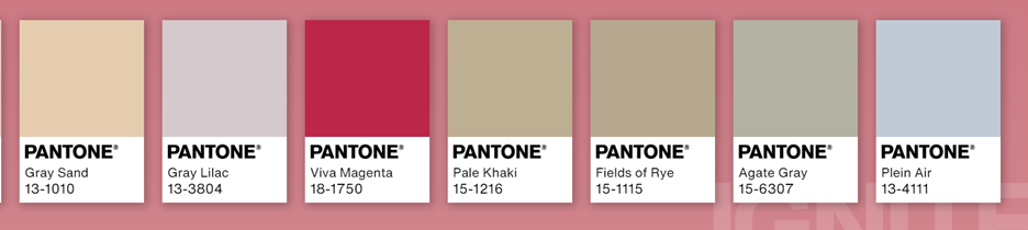
Pairing it with more neutral earth tones like Pale Dogwood, Gray Sand, Gray Lilac, or Plain Air would create great contrast and increase its effectiveness as a color.

Molly: It’s exciting to work with bright colors. I think when designing for corporate projects, designers tend to go with darker, muted, and neutral tones, but I think Viva Magenta is a perfect complimentary color to dark colors. It can really make certain elements pop off the page.
The color is stimulating and engaging to look at; I think it can be used to draw the viewer in and offer them something they haven’t seen before.

Lara: While my personal style is more minimalist, I love working with bright colors! I like to experiment with palettes to create the right tone. For such a saturated magenta, I can pair it with its opposite—a teal green—to add energy and demand attention.
Or, I can create a slightly softer but still energetic feel by pairing magenta with its neighbor colors, too. Purple, magenta, and orange seem to be quite popular lately! I feel like the Viva Magenta is a more optimistic version of the Millennial Purple that was trending. So, I like to keep that optimism in my magenta designs.
What do you think? Are you team Viva Magenta or are you already looking forward to 2024’s pick? Is this the color you would have selected for 2024?
Let us know in the comments.