I just returned from Las Vegas and Coverings, the Ultimate Tile + Stone Experience. And I mean “ultimate.”
More than 20,000 attendees came to Las Vegas to see the impressive array of beautiful tile and stone. I’ve been to countless trade shows in my time, and this one is truly extraordinary. What makes it so unique is the international flavor of the show. An attendee once said to me, “it’s like taking a trip around the world of tile and stone.” And that’s exactly what it is.
This year’s Coverings featured large pavilions from Italy, Spain and North America, plus exhibits from Turkey, Brazil, Egypt, India, China and more, among 3,000 booths and 800+ companies. It’s always fun to wander the show floor and see all of the exciting designs and materials sure to inspire anyone to redo their kitchen or bathroom. But what makes it even more enjoyable? A stop at Italy’s booth for an espresso in the a.m. and a little vino in the p.m., along with a good chunk of parma and a piece of prosciutto! Yum! At lunchtime, I made a beeline to Spain for some delicious Tapas. And this is the real deal. Chefs are imported from the native countries along with the cuisine!
I digress…perhaps it’s time for lunch!
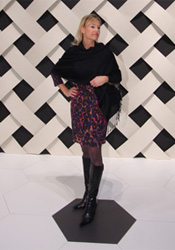
 As always, the show showcased the latest trends in tile and stone. It’s not just a square anymore. Textures, interesting shapes — the hexagon was a big one this year — large-scale formats up to 12″x48″ with a micro thin profile (see photo), all sorts of cool textures and patterns, like raised dots and basket weave, and dead ringers for other hard surface materials, such as marble, travertine and even hand-hewn wood planks. You really can’t tell the difference. It’s amazing how printing and inkjet technologies have been able to mimic what comes out of the ground.
Lots of design celebrities visited the show as well. I was able to hear Lee Eiseman, Executive Director of the Pantone Institute, give her color trends for 2012. She went through a number of interesting color palettes (PDF 163k), but through her worldwide research studies and design observations, Honeysuckle Pink (PMS 18-2120) is the “color of the year.” This has our creative team all aflutter. Pink? Really? Come on. How are we going to use pink in our next campaign? So I made sure to clarify with Lee that the pink is really an accent — an attention-getter to draw people in. So maybe a little splash here and there, for the right client, will make an impact.
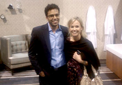
 I also met Ali Azhar from HGTV’s Design on a Dime. He was there to design a bathroom vignette during the show. All the materials were set, cut, installed and styled over the course of the four days. It was exciting to watch the room evolve. I guarantee that there was way more than $1,000 worth of tile and stone in this project! No dime-design here!
Coverings has been a long-time client of CSG, and being exposed to the industry, the culture, and the many dimensions of this exciting building products category helps inspire all of our campaigns and strategies. To view some photos of the many unique and beautiful tile and stone on display, visit coverings.com.
